Introduction
These little metal boxes we carry in our pockets have permeated nearly every aspect of our lives, transforming how we live, work, and connect. While this powerful technology has brought many benefits through its wide-ranging functionality–enabling us to complete tasks, achieve goals, communicate effortlessly, and even support our well-being–it has also come with significant costs. These devices can just as easily distract us from what’s truly meaningful, pull us away from being present in important moments, and even erode our social skills and mental health over time.
As with many things in life, their impact depends on how thoughtfully and intentionally we use them. When used mindfully, they can be beneficial. But if overused, even slightly, they can quickly become harmful. After reading The Anxious Generation by Jonathan Haidt earlier this year, as well as reflecting on the effects I’ve observed in my students over the past few years, I was inspired to examine my own habits more closely.
However, self-assessments can be challenging, as our personal bias often hinders our ability to see ourselves clearly. Fortunately, data can offer us a more objective perspective. In this project, I’ll explore some of my personal screen time data to gain a better understanding of my own habits and hopefully discover some areas for improvement, as well as focus on creating some insightful visuals with an emphasis on aesthetics.
Scraping and Formatting the Data
Thanks to some python code written by Felix Kohlhas, converting screen time data to a csv was straightforward. This included all screens associated with my apple account (laptop, tablet, and phone), but for purposes of this project, we’ll filter this down to just my phone. Here is a preview of what it looks like:
| App | Usage | Start Time | End Time | Created At | Time Zone | Device Model |
|---|---|---|---|---|---|---|
| com.apple.MobileSMS | 13 | 1733888411 | 1733888424 | 1733888425 | -18000 | iPhone13,1 |
| com.apple.MobileSMS | 10 | 1733888329 | 1733888339 | 1733888339 | -18000 | iPhone13,1 |
| com.apple.MobileSMS | 10 | 1733888099 | 1733888109 | 1733888109 | -18000 | iPhone13,1 |
| com.apple.MobileSMS | 10 | 1733887766 | 1733887776 | 1733887777 | -18000 | iPhone13,1 |
| com.apple.MobileSMS | 10 | 1733887746 | 1733887756 | 1733887756 | -18000 | iPhone13,1 |
| com.apple.MobileSMS | 14 | 1733887536 | 1733887550 | 1733887551 | -18000 | iPhone13,1 |
This includes a lot of valuable information, but we’ll need to clean it up and reformat it a bit.
App Names
First, names like “.com.apple.MobileSMS” aren’t the most readable, so I created a separate csv of all the app names (along with directories to their image icons) to merge with this data set. For example, this converts “com.duolingo.DuolingoMobile” to “Duolingo” and the aforementioned SMS to “Messages”.
# Load back in app names and join with screentime data
app_details <- read_csv('/Users/stevengambino/Desktop/app_details.csv')
df <- merge(df, app_details, by = "app", all = FALSE)
Usage
This is the amount of time the app was on screen in seconds.
Start / End Times
The start and end times of the various app instances are recorded in UTC format, so we’ll need to convert this to something more readable. Additionally, all times were adjusted using the time zone correction column prior to conversion. This is optional, but doing this will set all times displayed throughout this project to EST.
From here, we can identify the date range. Unfortunately, the data stored only goes back about a month (11/16/2024 – 12/11/2024). I was hoping to compare over a longer period, but this is all that is available for now.
# Convert the start/end date/time from UTC format
iphone_data <- iphone_data %>%
  mutate(start_date = as.POSIXct(start_time, origin = "1970-01-01", tz = "UTC")) %>%
  mutate(end_date = as.POSIXct(end_time, origin = "1970-01-01", tz = "UTC")) %>%
  mutate(start_time = format(start_date, "%H:%M:%S")) %>%
  mutate(end_time = format(end_date, "%H:%M:%S")) %>%
  mutate(start_date = as.Date(start_date)) %>%
  mutate(end_date = as.Date(end_date))

# Find the max/min date, and total range
min_date = min(iphone_data$start_date, na.rm = TRUE)
max_date = max(iphone_data$start_date, na.rm = TRUE)
range <- as.numeric(max_date - min_date)
Average Screen Time
Now that the data is cleaned up, we’ll explore with a few visuals. First, I simply want to understand what apps I used most. I have some guesses based on my own perception of my experiences, but displaying it as a bar graph will allow me to see this more objectively and concretely. To add a bit to the aesthetic, the chart features image icons as axis labels, rather than the app names, and an embedded Apple logo as the background to signify its usage from my iPhone. The images were downloaded from the internet, then edited/converted in photoshop (more specifically Affinity Photo) to a transparent png format with identical resolutions (200×200).
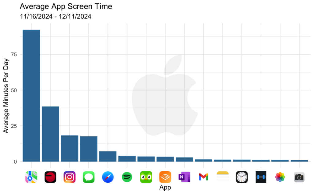
By in large, this matches my expectations, with a few exceptions. First, I drive entirely too much, usually commuting upwards of 1.5 hours on an average work day. So, it is not surprising that Maps (yes, I use Apple Maps over Google and Waze), is by far the most used app. The Polar app at number two is also unsurprising, as I generally bike about 60-90 minutes 3-4 times per week, and utilize the app to track my heart rate.
On the other hand, I expected Duolingo to be a bit higher and was hoping Instagram would be a bit lower. For Duolingo, I suspect this is a reflection of the fact that I’ve recently been using the Desktop version much more regularly than the mobile version. If I included the screen time from my Mac, it would likely better match my perception/expectation in this regard.
For Instagram, I’d still like to see this lower, though my sense is that if I was able to contrast this with the usage from the same month a year ago, this would be an improvement. Either way, this represents an area of potential improvement.
In any case, I’m happy with how the visualization came out. I do think the addition of the images adds a little personalization and uniqueness to the visual to make it more compelling and more professional. I can imagine a number of scenarios where this kind of customization in presentation can level up a visualization beyond just a standard bar graph. This was well worth developing a simple workflow for, as I will definitely be utilizing this more for future projects.
Understanding Usage Habits
While the above graph gives some insights to which apps I use most in totality, and to what degree, it doesn’t provide much insight into how I use them. For example, a concern with an app like Instagram is its infamy for pulling users into endless-scrolling or video-binging sessions for hours at a time. I do not believe I fall victim to this very often, if ever, but let’s confirm with the data to be sure. We can build a frequency distribution graph illustrating how often each app is used for different durations.
# Load app icons
instagram_icon <- png::readPNG("/Users/stevengambino/Desktop/iphone icons/Prepped/instagram.png")
duolingo_icon <- png::readPNG("/Users/stevengambino/Desktop/iphone icons/Prepped/duolingo.png")
maps_icon <- png::readPNG("/Users/stevengambino/Desktop/iphone icons/Prepped/maps.png")
messages_icon <- png::readPNG("/Users/stevengambino/Desktop/iphone icons/Prepped/messages.png")
safari_icon <- png::readPNG("/Users/stevengambino/Desktop/iphone icons/Prepped/safari.png")
polarbeat_icon <- png::readPNG("/Users/stevengambino/Desktop/iphone icons/Prepped/polarbeat.png")
image_list <- list(Instagram = instagram_icon,
                   Duolingo = duolingo_icon,
                   Maps = maps_icon,
                   Safari = safari_icon,
                   PolarBeat = polarbeat_icon,
                   MobileSMS = messages_icon)

# Loop through key apps to create plots for each
key_apps <- c('Instagram', 'MobileSMS', 'Safari', 'Maps', 'Duolingo', 'PolarBeat')
plot_list <- list()
for (key_app in key_apps) {
  # Load image and add transparency
  img <- image_list[[key_app]]
  # Scale transparency uniformly across all channels
  alpha_value <- .75

  # Set caption
  caption = if_else(key_app %in% c('Maps', 'PolarBeat'),
                    '*Excluding Outliers of Greater than 32 minutes.',
                    '')

  # Create an alpha channel and apply transparency
  img_alpha <- array(
    c(
      img[,,1],  # red
      img[,,2],  # green
      img[,,3],  # blue
      img[,,4] * alpha_value
    ),
    dim = c(dim(img)[1:2], 4)
  )

  # Create a grob with transparency
  aspect_ratio <- dim(img)[2] / dim(img)[1]
  new_width <- 2.5  # cm
  new_height <- new_width / aspect_ratio
  background_image <- rasterGrob(img_alpha, interpolate = TRUE, width = unit(new_width, "cm"), height = unit(new_height, "cm"))

  # Build Graph
  p <- dist_df %>%
    filter(app_name == key_app) %>%
    mutate(minutes = usage / 60) %>%
    ggplot(aes(x = minutes)) +
    annotation_custom(
      grob = background_image,
      xmin = -Inf, xmax = Inf,
      ymin = 0.5, ymax = Inf
    ) +
    geom_histogram(binwidth = 0.5, fill = mako_palette[50], color = mako_palette[50]) +
    labs(caption = caption) +
    scale_x_continuous(limits = c(-1, 32)) +
    scale_y_continuous(trans = log_trans(base = 10),
                       limits = c(1, 1000)) +
    theme_minimal() +
    theme(axis.title.x = element_blank(),
                  axis.title.y = element_blank(),
          plot.margin = margin(10, 15, 30, 30))

  plot_list[[key_app]] <- p
}

# Combine all plots into a grid with extra space for global labels
grid_plots <- arrangeGrob(
  grobs = plot_list,
  ncol = 2,
  top = textGrob("Frequency Distribution of App Usage (11/25 - 12/11)", gp = gpar(fontsize = 16, fontface = "bold"))
)

# Open a output session
jpeg("/Users/stevengambino/Desktop/Frequency Dist of App Usage.jpg",
     width = 9, height = 9, units = "in", res = 300)

# Draw the plot and text elements
grid.newpage()
grid.draw(grid_plots)
grid.text("Usage (minutes)", x = 0.5, y = 0.035, gp = gpar(fontsize = 14))
grid.text("Frequency", x = 0.02, y = 0.5, rot = 90, gp = gpar(fontsize = 14))

# Close session
dev.off()
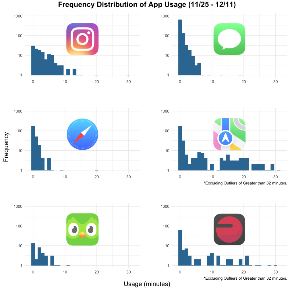
This allows us to identify a few patterns. First, only Maps and PolarBeat are regularly used for extended periods. This is positive since those apps aren’t necessarily destructive uses of my phone, and in both cases, “screen-time” isn’t me actually staring at the screen. Instead, it’s just glancing to check the next direction or my current heart rate zone.
Another interesting note is the contrast of how I use Instagram and Messages. These apps were fairly similar in average daily usage, but this chart illustrates how Messages is used frequently in short bursts, whereas Instagram sessions, while fewer, tend to be a couple minutes at a time. This makes sense as it’s common to quickly open the messages app to read and reply to a quick text, but there is usually no reason to keep it open for many minutes.
Usage Over Time
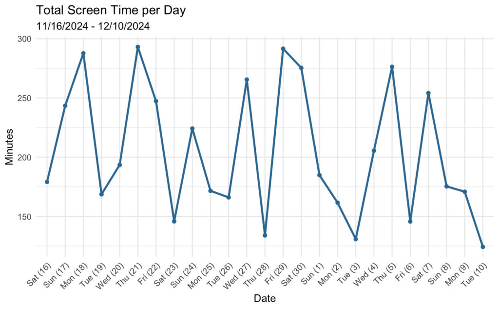
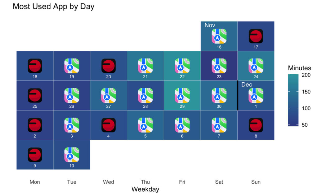
Because our habits can be at least somewhat dependent on our schedule, environment, and overall rhythm of our lives, I think there’s value in exploring how the usage changes over time. The tricky part of this, however, is that because Maps and Polar Beat so significantly dominate my screen time, plotting total usage over time is largely a reflection of when I use those apps. In particular, we can notice many of the highest-usage days are a Monday, Wednesday, Friday, or Saturday – all days where I typically bike and work in-person (so I’m commuting a lot). In contrast, Tuesdays are often the lowest usage days – I usually don’t bike and I work from home.
So, at least within the short window of time we have access to, this generally matches what I might have expected, albeit with some noise. Let’s instead break it down on an app by app basis to see the picture a little more clearly.
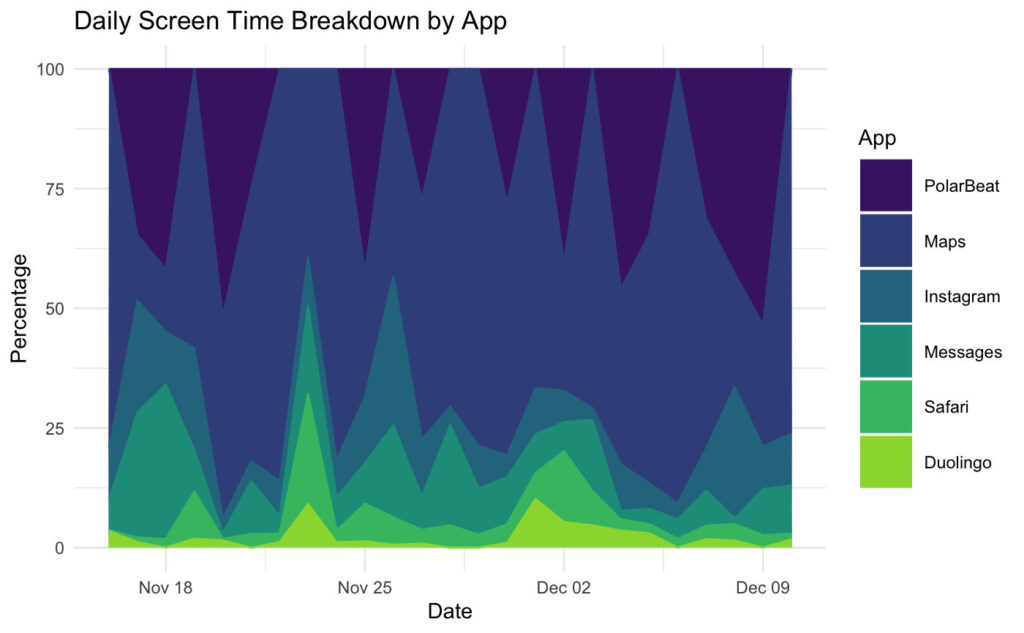
This graph really highlights how large of a proportion of my screen time is made up of Maps and PolarBeat. On average, this is pretty steady over time, but day-day-day, this can fluctuate quite a bit too. It’s really only on days where I’m not biking and driving minimally that the other apps start to make up a majority of my phone usage. While the overall screen time can sometimes seem high, this helps put that into perspective and leaves me feeling more positive about my habits than had I just focused on the overall numbers over time.
Now that we have a feel for my most utilized apps as well as how that changes over the course of a month, I think one last visual can summarize this quite neatly – let’s put it on a calendar.
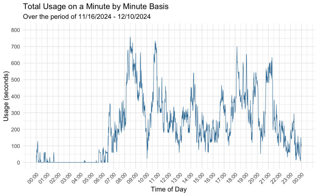
Understanding the day-by-day trends can be valuable, but it’s also interesting to look at how usage varies across the day. What times does usage tend to spike? When are there lulls? This chart can paint a picture of the rhythm of my day based on screen time usage, especially considering we’ve already learned that the majority of my screen time comes during my workouts or my commute.
One positive note that this graph seems to suggest is that I have relatively healthy and consistent sleeping habits, as there is minimal usage between midnight and 6am. On the other hand, my workouts are most often in the mornings between 8-9:30am, which represents the biggest peak. Additionally, I’m typically commuting into work around 10:30-11am and commuting home around 9:00pm, with both of these times representing two of the other biggest peaks in usage.
Conclusion
Overall, I’m happy with how these visualizations turned out. The customization adds uniqueness to the charts, making them more engaging than standard, stock graphs. More importantly, each one communicates a part of the story of my screen time habits, offering some valuable insight to reflect on – what’s positive about my relationship with my phone as well as areas for potential improvement. Data visualization is great for painting clear pictures and delivering accessible insights, and I believe these charts effectively achieve that goal. And hopefully, allow me to continue to better and more thoughtfully use my phone in a way that can add value to my life, rather than take away from it.
